|
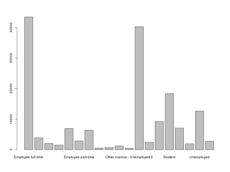
| Bad barplot |
Text is read horizontally, so unless the descriptions of variable values are short, they will be hard to fit into a vertically oriented plot.
To get a horizontally oriented bar plot, use
barplot(.., horiz = TRUE)
But in order to get the labels right, you will have set the las parameter to 1.
par(las = 1)
And, in addition, the left margin needs to be increased for the labels to fit in it.
par(mar = c(5, 20, 4, 2) + 0.1)
Together these settings will essentially solve the problem, as seen in figure 2 below.
barplot(table(my.df.full$clustering2), horiz = T)
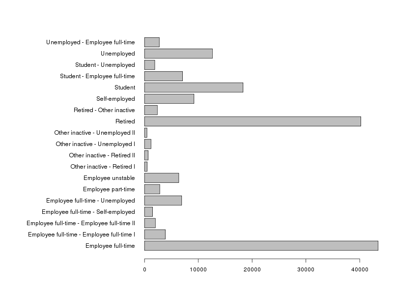 |
| Good barplot |
To further enhance this kind of plot, you might want to add the number in each category, and for that purpose you can use the following snippet of code:
my.data <- table(my.df.full$clustering2)
par(las = 1, mar = c(5, 20, 4, 4) + 0.1)
my.y.coords <- barplot(my.data, horiz = T, plot = F)
my.x.coords <- as.numeric(my.data)
my.x.offset <- max(my.x.coords)/100
barplot(my.data, horiz = T, xlim = c(0, max(my.x.coords)+my.x.offset + 10 * my.x.offset))
for(i in 1:length(my.x.coords)){
  text(my.x.coords[i] + my.x.offset, my.y.coords[i], my.x.coords[i], adj = c(0, 0.5))
}
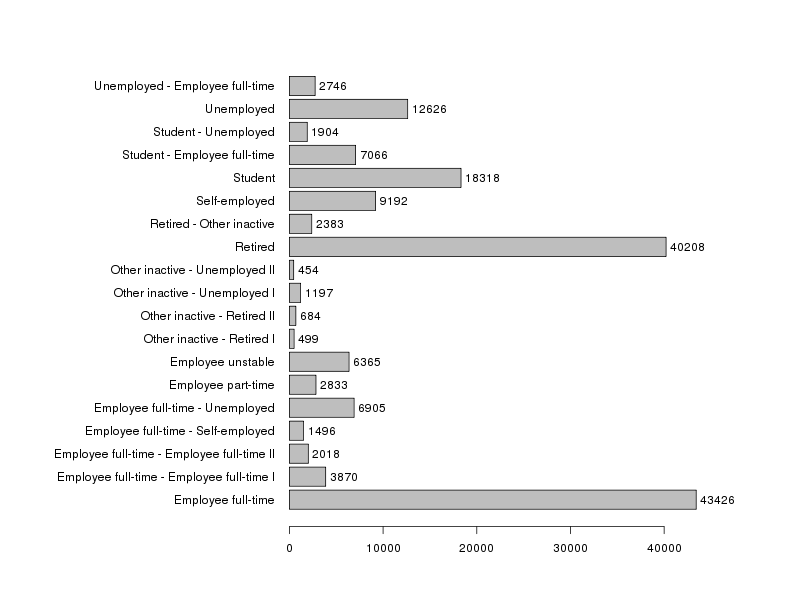 |
| Enhanced barplot |
You may want to adjust the mar argument of par() and the xlim of the second barplot() call, if the names of your categories differ substantially from the ones in the example.
![[Valid RSS]](valid-rss-rogers.png "Validate my RSS feed")

